
It’s a rhetorical question. Of course you can use wallpaper anywhere you damn well choose. And it’s just as well. There are too many gorgeous designs of wallpaper out there to restrict its use in any way. And even if I had enough walls in the house (which I don’t) and enough adventurous clients willing to experiment (I wish), I’d never get to use a fraction of the designs on my to-use list. But even though I’m a big fan of adding colour and pattern in any room in the house in this way, I’ll always urge a little caution. Not many people can live with clashing patterns all in one room (although I did once work for a designer who’s trademark was just this), and most people (me for one) need some plain places to rest the eye now and again.
The Kitchen
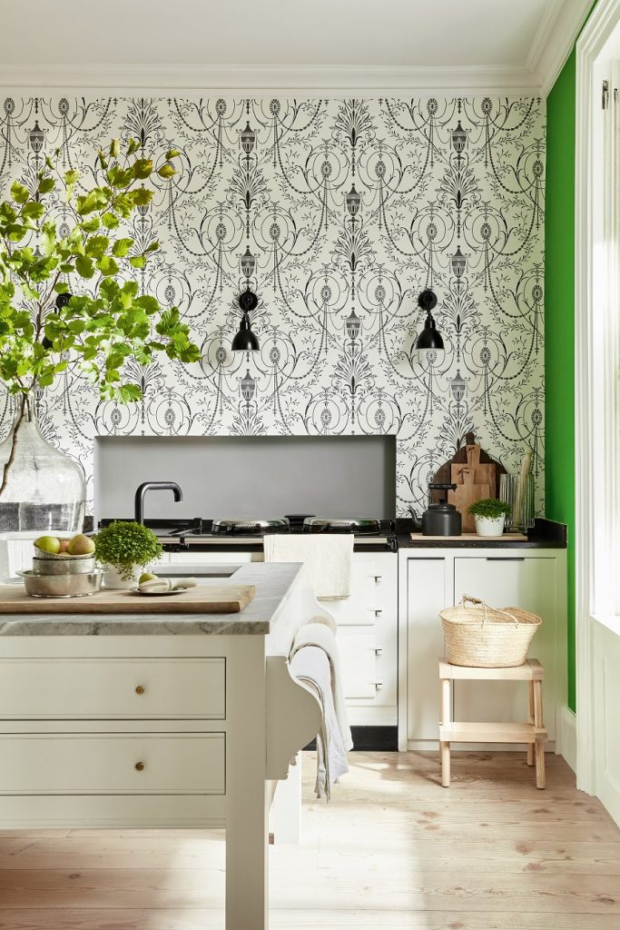
Not the first choice of wall-covering for most people, but wallpaper can be used in the kitchen to stunning effect. The walls behind the cooker and sink are obviously going to need some protection to stop oil and water marks, but a splash-back of plain glass can always be used and doesn’t hide the paper underneath. This classical black and white patterned paper enhances the period feel of the kitchen and the high ceiling, but is brought bang-up-to-date with the addition of a bright green wall. And space behind the stove is cleverly protected by wipe-able paint. Not in matching green mind, that would have been overkill, but dark grey to coordinate with the marble topped island.
The Chimney Breast
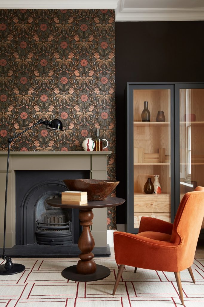
Sometimes just using wallpaper on the chimney breast is enough, especially when the pattern is as busy as this. And especially true when there is other things happening in the alcoves either side. The wallpaper reinforces the fireplace as the focal point of the room and draws the eye to exactly where it should be. Using a dark colour either side of the pattern on the other hand makes the walls recede and throws the cabinet into focus. I especially like the way the orange has been picked up in the velvet armchair (but don’t be tempted to use more orange items if you do this at home) and the way the interior of the cupboard also compliments the colour scheme in a natural way.
The Hallway
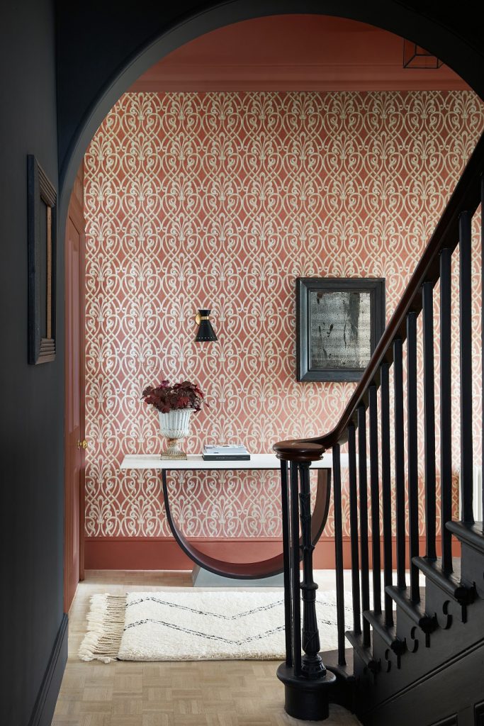
Don’t be afraid to use wallpaper in the hallway. It’s the first space visitors see and it’s important to convey a warm welcome, which colour and pattern does very well. If you are worried walls are more likely to get damaged in this high traffic area there are ways to avoid this. The hall above has cleverly used wallpaper on the wall least likely to be scuffed or touched by sticky fingers. The placement of the console table helps. In the narrow corridor where the walls will be at more risk, paint (and dark paint at that) has been used. The dark into light effect is also very deliberate. It makes the end of the hall look bigger and brighter.
The Bathroom
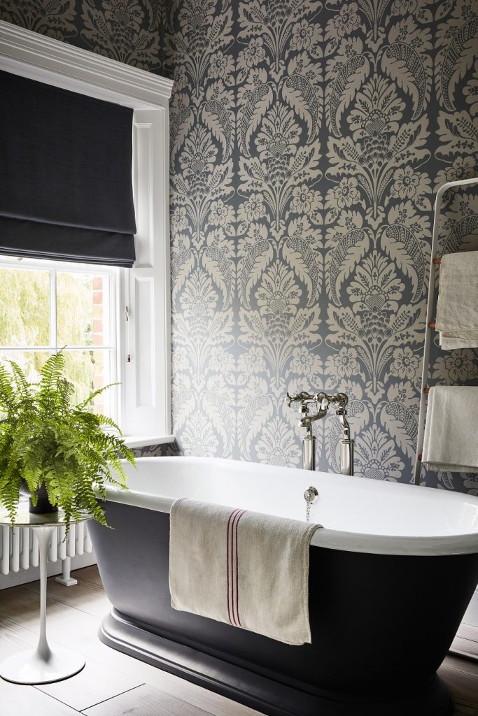
Yes, you can absolutely use wallpaper in a bathroom as long as the room is well ventilated. I’d personally still put tiles behind any basins to keep splashes of water off the paper and obviously the shower enclosure needs to be waterproof. But when the bath is away from the wall (as above), paper is fine. A bold design like this works well with plain white sanitary-ware, blinds and the black bath. It’s a classic style that will never go out of fashion.
Everywhere?
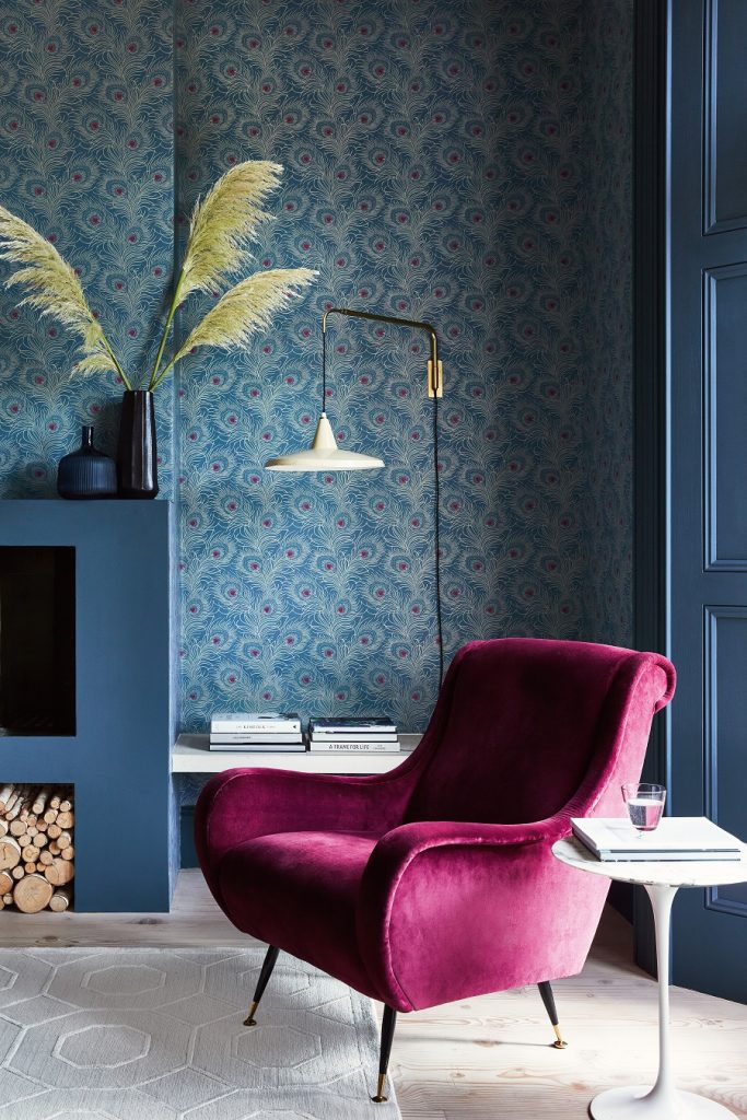
Sometimes you just have to throw caution to the wind. But the reason this room looks so harmonious is because the paintwork has been painted a similar blue to the background of the pattern. White would have thrown the paper out too much but blue has lessened the impact nicely. Again, if you do this at home, one accent pink chair is enough. The rest of the scheme is quite minimal and the grasses in the vase are a nice touch as they echo the peacock feathers in the paper.
Add Balance
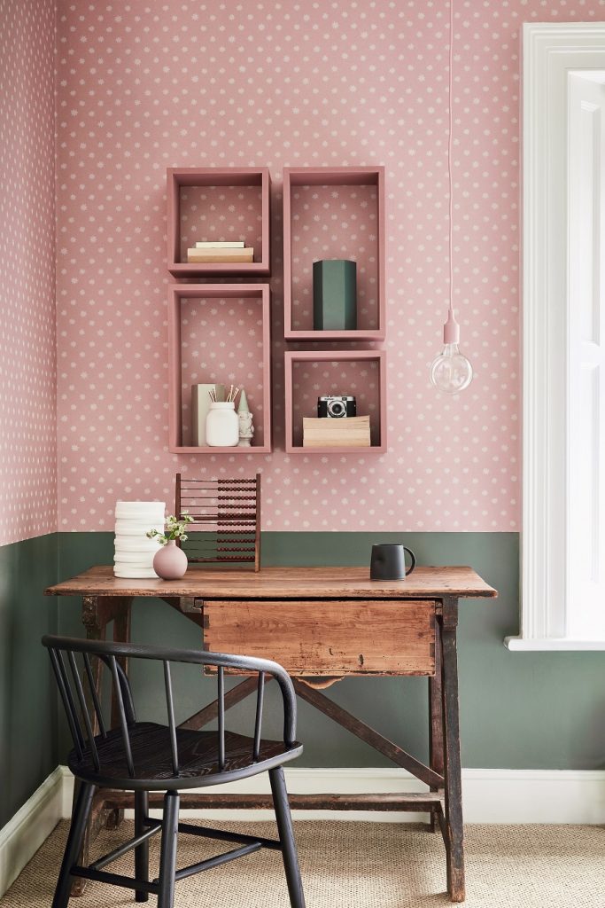
An effective designer trick is to mimic a dado rail and paper the walls above, with plain painted walls below. This way the wallpaper is not so overpowering, and it’s particularly effective with small pattern repeats. It could also be a good solution to the problem of wallpapering a hall where the lower walls are more likely to get scratched and scraped (see above also). I like that an unexpected green has been used here. Pink or white (although they would coordinate with the wallpaper) would have been too girly. And I also like the way the plain painted lower wall throws the vintage furniture into sharp relief. Tiling the lower half of a wall in a bathroom would have the same effect.
The Dining Room
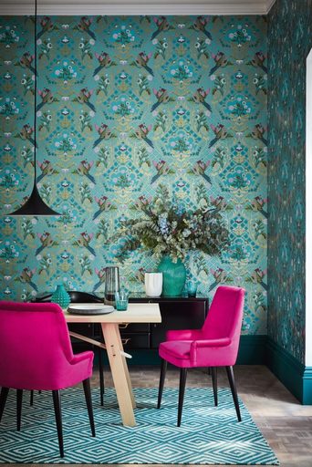
It there’s one room where you can really go to town, it’s in the dining room. This is a room that is mostly used for entertaining and not for everyday use, so you won’t tire of bold colours or pattern too soon. And who doesn’t want to wow guests with a talking point? The metallic accents in the pattern will catch the light at night and provide even more atmosphere for an intimate dinner party. This one has to be my favourite!